The interiors of the kitchens of country houses are distinguished by their layout, design style, materials for surface finishing and color solutions. After reading this article, you will get an idea about the basic requirements for kitchen design, what interesting ideas people have embodied in their kitchen and how to combine all this with the furnishings of other rooms.
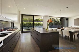
The layout of the kitchen in a private house
The kitchen design must take into account individual room features:
-
sizes and form rooms;
-
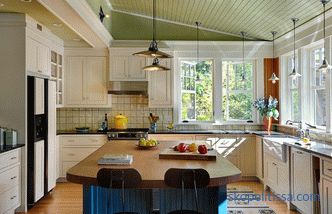
the combination / separability with the rest of the rooms;
-
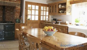
stove heating (tiled stove) or boiler in the kitchen;
-
number windows and doors in the room (walk-through kitchen, exit to the terrace, etc.)
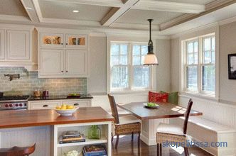
From what answers will be given to These questions depend on the layout of the room.
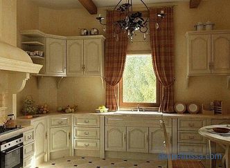
When planning the interior, follow the rule of the working triangle: the distance between the sink and refrigerator is from 0.45 to 2 m; from the gas or electric stove to the sink - from 0.6 to 1.8 m. On the way from the refrigerator to the sink there is a primary processing zone for food, boxes or shelves with cereals and pasta. From sink to hob: heavy kitchen utensils, dishwasher, microwave and more.
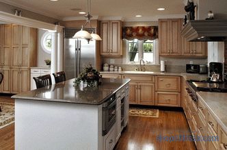
Kitchen-dining room and kitchen-living room
If the room is combined with the rest the premises of the house: the living room or the dining room, the design of the kitchen requires special attention to the little things and the compatibility of the furnishings with each other. The open layout assumes a perfectly thought-out interior.
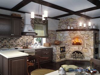
Design Tips:
-
In a room you will need to install a powerful hood in order to prevent smells from cooking throughout the whole house.
-
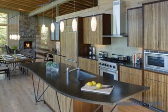
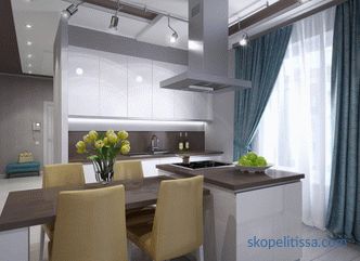
The interior of the kitchen in the house is better designed in minimalism , eco-style , neo-classical , Scandinavian style as the mess in the kitchen can be very annoying to the household in the living room.
-
Otherwise, you can divide the space of the kitchen-dining room by installing small movable partitions , screens .
-
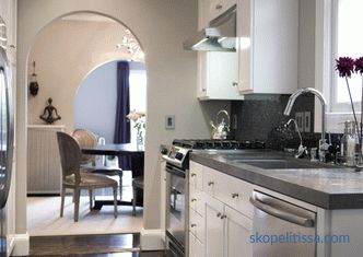
In a country house where the kitchen-living room is combined, arched openings or columns in classic style will look interesting, glass partition from floor to ceiling.
-
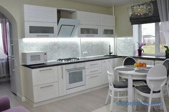
To make the room look organic, zone space: in the kitchen, use tile for the floor , porcelain tiles , and in the living room - laminate , parquet .
-
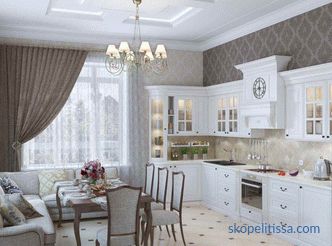
Multi-level ceiling and walls with different finishes (in the kitchen - tiles, in the living room - wallpapers) will also allow to delimit the space and bring dynamics to the room. Paths and carpeting will also help to zone the room.
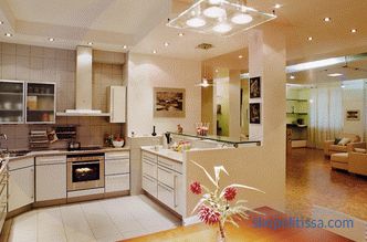
-
Diverse lighting zones (in the kitchen - brighter lighting, in the living room - more muffled and soft). Luminaires in the work area can be more than modest and concise, in the recreation area and dining room - luxurious , differ in abundance of details.
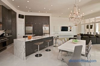
-
Total backlight in the kitchen is complemented by LED above the surfaces. In the living room, a special charm is given with the help of wall wall lamps and floor lamps .
-
At the borders of kitchen and dining / living areas there are pieces of furniture: bar counter, sofa , table with chairs, island for cooking and breakfast, shelves with books and much more.
Walk-through kitchen
If a room has several entrances / exits, it is advisable to reduce their number to a minimum, for example, by combining a veranda and a kitchen.
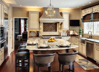
The design of a small walk-through kitchen in a private house requires compliance with the following rules:
-
position work triangle (sink, stove, refrigerator) aside from the main route of family members (entrance hall-living room), so passing will not interfere with the cooking process.
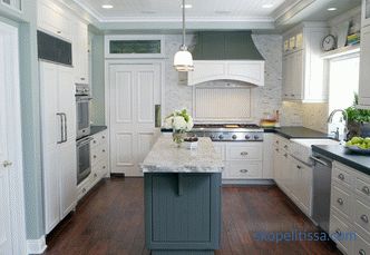
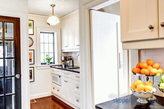
-
The dining table can be positioned in the window to quietly enjoy your meal.
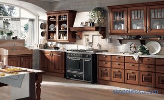
-
Next to veranda or ; storage room place the refrigerator. It will be convenient from the pantry to immediately put the desired product in the refrigerator and, if necessary, get it. Likewise, when going out to the summer premises, on the terrace, you can take along provisions for organizing a feast in nature.
Work areas in the walk-through kitchen are more often parallel to each other or with the letter “G”, less often there is a “P” shaped layout.
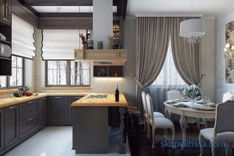
The refrigerator in the “L” -shaped arrangement of objects should be placed in line with the sink. Ideally, the latter can be placed in the corner of the kitchen.
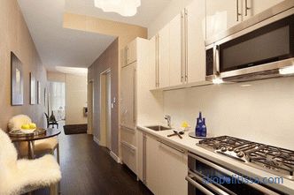
A parallel arrangement of objects is used in a narrow walk-through kitchen. On one line have a sink and stove, and on the second - a refrigerator and a peninsula. The width of the passage between the working surfaces should be at least 1.2-2.4 m.
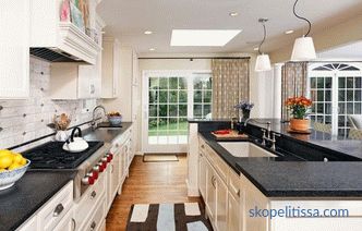
Kitchen over 20 square meters. m
A large kitchen of the correct form (rectangular or square shape) with a separate entrance is the dream of most of the owners of a country house. In such a room, with the proper organization of space, it is pleasant to receive guests and cook food.
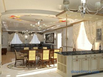
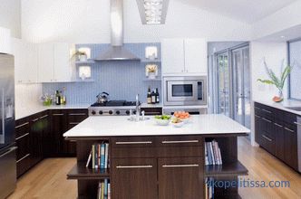
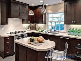
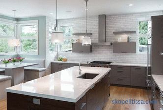
Many designers advise installing a kitchen set with a separate table-island for cooking and eating. Then ready meals can be immediately sent to the household for tasting or just chatting with them while dinner is being prepared. A multifunctional island usually also includes a sink and a small refrigerator with a stove and oven, food storage cabinets (groceries), a wine department, etc.
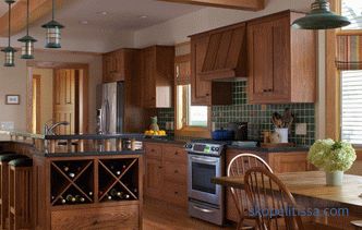
For organizing an island kitchen, it is important that the passages around such a miracle table be at least 1-1.2 m.
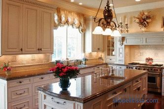
In a large square kitchen with a lot of doors and windows, cooking island is often the only way out of this situation. In small niches along the wall, you can put a refrigerator and microwave, oven, and other cabinets for food storage. The dining area in the square kitchen is often placed by the window.
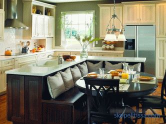
A popular solution among designers is to place the sink by the window. Then the process of washing dishes can be combined with the observation of the garden / garden, children's playground, depending on where the kitchen windows go. Also here you can arrange a working area with a refrigerator and cabinets for storing cereals.
Kitchen less than 20 square meters. m
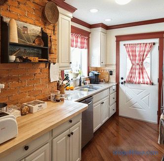
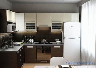
The interior of a small dining room in a private house with a cooking area includes kitchen cabinets, a stove and a fridge with a sink located in one line along one wall. Then along the wall opposite you can place a dining area. Such an arrangement is fully justified with a lack of square meters.
Important ! Which style directions are most popular in a country house depends on the general style of the facade of the building and the materials from which the house is made.
Kitchen in a log house
In wooden log houses, where the exterior breathes with antiquity and comfort, the French country style will look most harmonious - Provence or Country, Russian style of country estate, rustic or Gustavian design directions.
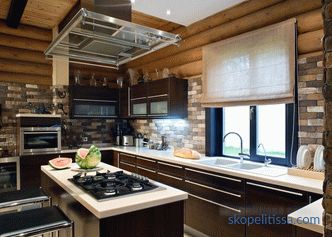
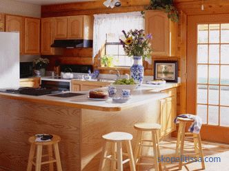
On our site there are 183 villages with the best land plots in the Moscow region in all directions . You can independently choose for yourself the best option, using the filters and set the desired distance from the Moscow Ring Road, the availability of communications and infrastructure, area, cost per hundred square meters.Or use the application form for selection and representatives of the exhibition "Low-Rise Country" will make an offer based on your wishes.
Kitchen "Provence"
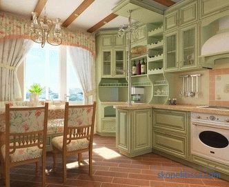
The design direction is characterized by unobtrusive finish and subtle color decisions. Shades of walls, textiles as if burned out in the sun: these are olive, lavender and lemon with golden, beige.
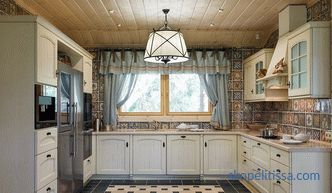
Time-torn, painted furniture, doors and facades of kitchen units can be either white and turquoise, olive, blue-blue, sandy.
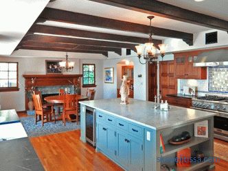
The pattern on the curtains is often small in flowe or with plant motifs. Walls are painted in shades of white, corn or milky.
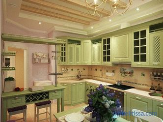
The most attractive detail of Provence is natural color ceiling beams, a large vintage sideboard, and textiles with floral motifs (scallops, cockerels, daisies, lavender, dandelions, sunflowers): tablecloths, potholders, towels, curtains, everything here gives the village.
Kitchen "Country"
The style is very similar to Provence. It also applies a maximum of wood in the decoration of facades, floor, ceiling. There is a ban on the use of plexiglass and plastic in such a kitchen. Kitchen apron can be decorated with tiles with floral patterns.
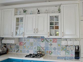
Lamps are used with fabric shades, the chandelier can be forged from bronze. The facades of the kitchen are decorated using decoupage technique. On the floor often homespun rugs.
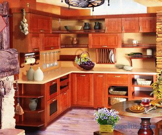
Country loves attention to detail. Kitchen shelves are most often open, with painted plates, copper and wooden utensils.
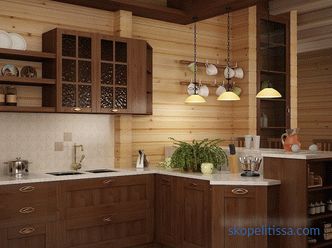
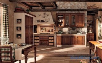
Clay pots with spices and herbs in the kitchen fit perfectly into the interior. Under the ceiling often hang bundles of onions and garlic.
On our site you can see the most popular projects of houses from 3 to 1887 m² from double and glued timber - from construction companies represented at the exhibition “Low-Rise Country”.
Kitchen in a house made of wood, glass and metal
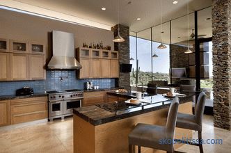
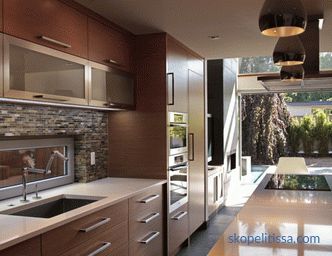
If the building has metal and glass parts, for example, large panoramic windows or walls, modern industrial styles will fit well into the room: Scandinavian, high- tech loft.
"Scandinavian" cuisine
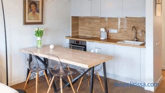
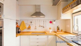
The modest and minimalistic design of Scandinavia will suit white lovers. This style is ideal for the kitchen, as if merging with the natural landscape through large windows. Since it uses a minimum of detail, the kitchen seems spacious and uncluttered.
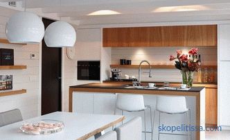
Style welcomes light wood for furniture and flooring (alder, pine, linden , ash), glossy facades with a minimum of decor. Olive, orange, yellow colors are used as color accents.
On our website you can find contacts of construction companies that own a full cycle of their own production , offer a turnkey design and construction service of country houses of any size and area, technology and materials with a guarantee of up to 13.5 years. Directly to communicate with representatives, you can visit the exhibition of houses "Low-rise Country".
High-tech Kitchen
High-tech is a modern style based on the use of high technology. Household appliances play an important role in the kitchen: built-in hob with oven, smart coffee machine, switched on from a smartphone, etc. Technical devices require remote control of appliances in the kitchen, high-tech also uses fronts without handles with opening by pressing, built-in backlight, responsive to movement and more.
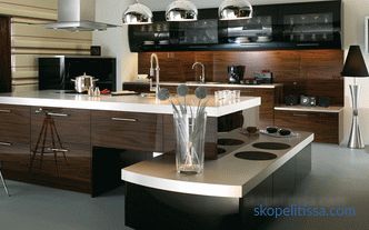
As a kitchen apron, use tempered glass with a monochrome coating. Walls can be painted, less often - pasted over with wallpaper with a pattern in the style of techno.
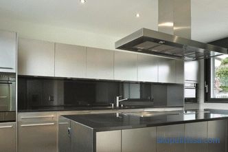
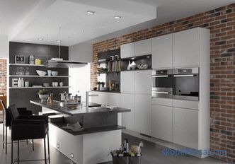
Color preferences: steel and blue, white, khaki and some wood without a pronounced texture.
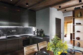
Kitchen "loft"
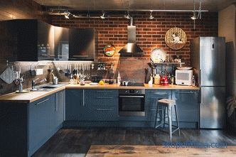
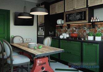
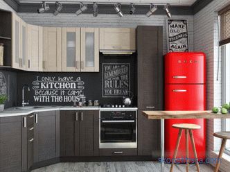
For country kitchens it is rarely used.It welcomes the walls of brick, processed to a minimum, decorative plaster, imitating concrete.
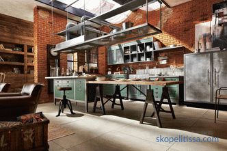
Technical constructions such as air vents do not hide, but are shown off.
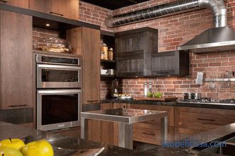
Here, side lighting is used for a kitchen apron to emphasize its texture.
It could be interesting! In the article on the following link, read about what you need to know when designing the living room design in a house with a fireplace .
The kitchen in the house of stone and brick
The choice of style for the kitchen in such a house is wide, it can be an eternal timeless classic: Empire, chinoiserie, American or English style.
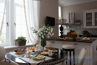
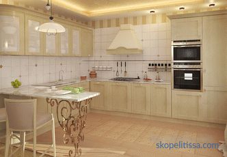
Classic
The classic style is the most preferred for the interior design of the kitchen. Furnishing the kitchen, apply the rules of the symmetrical arrangement of furniture, to mask the weaknesses used built-in niches with lighting, columns with pilasters.
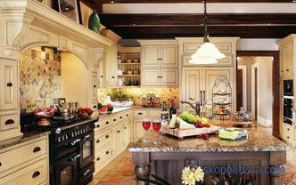
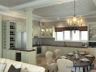
All materials must be natural. If the table and chairs are wooden, the facades of the kitchen set are more often with paneled parts, the ceiling is gypsum-board, split-level or tensioned.
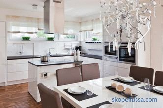
Kitchen appliances should not stand out here, its shades vary from white to metallic.
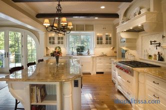
Textile ornament: cell, stripe, floral pattern.
Neoclassic
Modern classics harmoniously fit into the design of a combined kitchen-dining room or living room. It uses a combination of old accessories like wrought-iron chandeliers with candlesticks with the latest lamps.
Wall decoration elements: moldings and cornices, mirror cloths, etc.
Kitchen Design Expert represents the design and layout of a kitchen for a country house - kitchen design and ergonomics:
This could be interesting! In the article on the following link read about the rules of competent zoning of the interior of the kitchen-living room in a private house .
Kitchen in the mansard house
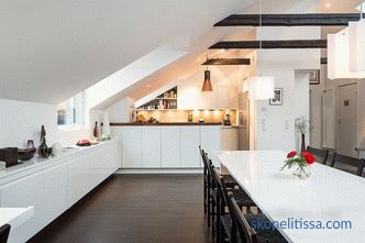
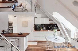
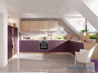
If for some reason you have to arrange kitchen placement on the attic floor or the house project is very unusual and the room consists of sloping walls and sharp corners, linear kitchen planning will help , providing for the placement of kitchen cabinets and the work area as a whole, along one wall.
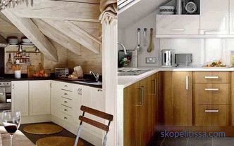
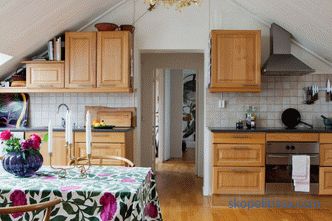
As for the style for such a project, any of the modern styles can be chosen here: modern, minimalism, eco-style, art deco.
Kitchen in an "eco-style"
Finishing a kitchen in a private house suggests only natural materials: rattan, bamboo, cork, wood, metal in minimal quantities, stone.
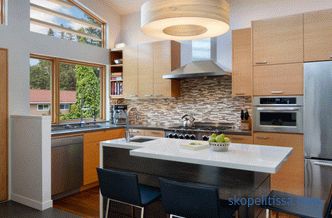
are harmless Colors: natural shades of wood, greenery, stone and flowers.
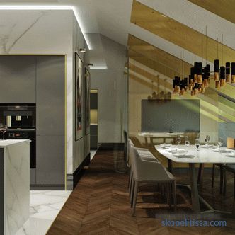
Art Deco Kitchen
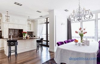
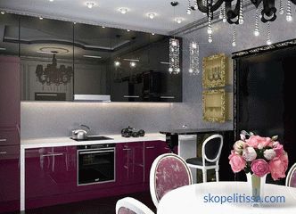
Art Deco has a very bold and sophisticated style in the interior. Used combinations of classic, ethnic and modern interiors. Only a professional designer with a great sense of taste will be able to embody it. It uses a variety of color combinations: from purple to pearl, bright accents and unusual materials.
How to combine kitchen design with the house
The kitchen interior in a private house is planned based on the style of the rest of the premises. If the living room and bedrooms are made in neoclassicism, design the kitchen design in the same direction. Hi-tech can be combined with the techno-style and any industrial style (constructivism, loft). Scandinavian is essentially an offshoot of eco-style. Provence and country - related design directions. Materials used for decoration are the same as in other rooms, so the unity of design is preserved.
It may be interesting! In the article on the following link, read how to objectively evaluate the value of a piece of land and What you need to know before buying .
Council for choosing the style
If you have just built a house and have not yet decided in what style to design it and how to organize everything properly, pay attention to modern styles and simple classics (Provence, country music).
Classic styles with an abundance of details and expensive in terms of implementation (Rococo, Baroque, Gothic, Empire) rarely used in country houses, often it is mixed and simple modern directions, giving a feeling of spaciousness and cleanliness in the room.
Video about the design of modern kitchens for a country house, ideas for different squares and a combination of styles:
It may be interesting! In the article on the following link read about Cozy Art Nouveau cottage by the ocean from the architectural studio Sigge Arkkitehdit Oy .
Summary of the topic
Kitchen is the heart of the house. The mood of the family depends on how beautifully and competently they will furnish and decorate it. Country house presents more opportunities for the choice of interior design, but it all depends on the owners of the house. What style and layout to choose, what materials to use, all this is exclusively your choice.
